Appearance
定位布局
基础知识
定位的基本思想很简单,它允许你定义元素框相对于其正常位置应该出现的位置,或者相对于父元素、另一个元素甚至浏览器窗口本身的位置。
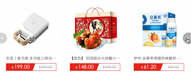
轮播图是典型的定位应用
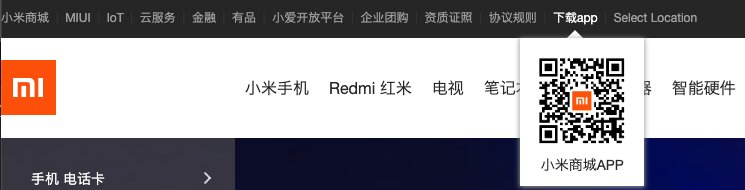
下面弹出的二维码也可以使用定位处理
定位类型
| 选项 | 说明 |
|---|---|
| static | 默认形为,参考文档流 |
| relative | 相对定位 |
| absolute | 绝对定位 |
| fixed | 固定定位 |
| sticky | 粘性定位 |
位置偏移
可以为部分类型的定位元素设置上、下、左、右 的位置偏移。
| 选项 | 说明 |
|---|---|
| top | 距离顶边 |
| bottom | 距离下边 |
| left | 距离左部 |
| right | 距离右边 |
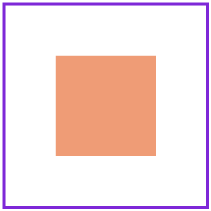
HTML
<style>
body {
padding: 50px;
}
article {
width: 300px;
height: 200px;
border: solid 6px blueviolet;
margin: 20px;
}
div {
font-size: 25px;
background: #f2a67d;
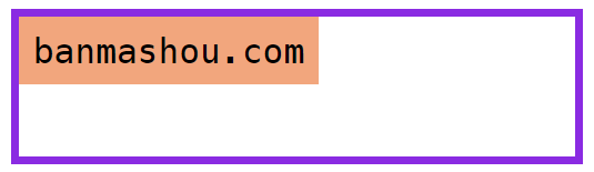
padding: 10px;
position: absolute;
top: 0;
}
</style>
...
<article>
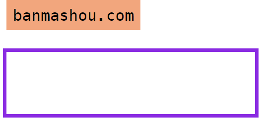
<div>banmashou.com</div>
</article>
HTML
<style>
    main {
        width: 150px;
        height: 150px;
        background: #1abc9c;
        position: relative;
    }
    main div {
        box-sizing: border-box;
        width: 200px;
        height: 200px;
        background-color: #f1c40f;
        background-clip: content-box;
        border: solid 1px #333;
        color: white;
        font-size: 2em;
        position: absolute;
        left:100%;
    }
</style>
<main>
    <div>banmashou.com</div>
</main>
相对定位
相对定位是相对于元素原来的位置控制,当元素发生位置偏移时,原位置留白。
HTML
<style>
body {
padding: 50px;
}
article {
width: 400px;
height: 200px;
border: solid 10px blueviolet;
font-size: 14px;
padding: 30px;
}
article img {
width: 50px;
position: relative;
top: -20px;
}
</style>
...
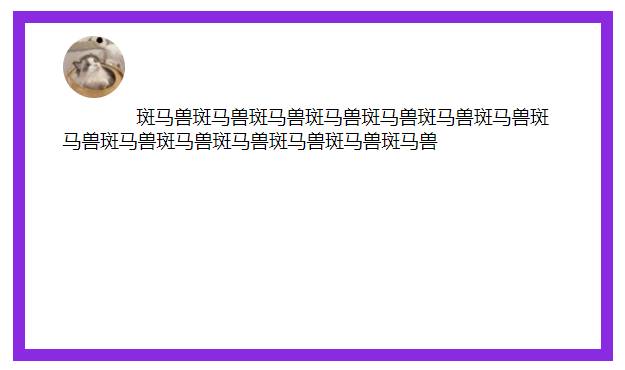
<article>
<img src="bm.png" alt="">
斑马兽斑马兽斑马兽斑马兽斑马兽斑马兽斑马兽斑马兽
</article>绝对定位
绝对定义不受文档流影响,就像漂浮在页面中的精灵,绝对定位元素拥有行内块特性。
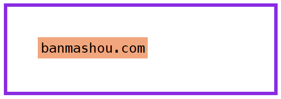
参照元素
如果父级元素设置了 relative | fixed | sticky ,绝对定位子元素将参数此父元素进行定位。
HTML
<style>
    body {
        padding: 50px;
    }

    article {
        width: 400px;
        height: 100px;
        border: solid 6px blueviolet;
        position: relative;
    }

    div {
        font-size: 25px;
        background: #f2a67d;
        padding: 10px;
        position: absolute;
        top: 0;
        left: 0px;
    }
</style>
...

<article>
    <div>banmashou.com</div>
</article>
默认位置
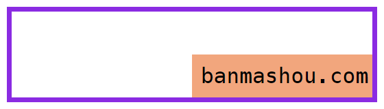
如果没有为定位元素设置偏移,将受父元素的 padding 等属性影响。但使用定位一般都会设置偏移位置。
CSS
body {
    padding: 50px;
}

article {
    width: 400px;
    height: 100px;
    border: solid 6px blueviolet;
    position: relative;
    padding: 20px;
}

div {
    background: #f2a67d;
    padding: 5px;
    position: absolute;
    top: 50px;
    left: 50px;
}
设置尺寸
可以通过定位的偏移值设置元素的尺寸。
HTML
<style>
    body {
        padding: 50px;
    }
    article {
        width: 400px;
        height: 100px;
        border: solid 6px blueviolet;
        position: relative;
    }
    div {
        font-size: 25px;
        background: #f2a67d;
        padding: 10px;
        position: absolute;
        top: 50%;
        left: 50%;
        right: 0;
        bottom: 0;
    }
</style>
居中定位
通过将 left 设置为 50% ,并向左偏移子元素宽度一半可以实现水平居中,垂直居中使用方式类似。
HTML
<style>
    body {
        padding: 50px;
    }
    article {
        width: 400px;
        height: 400px;
        border: solid 6px blueviolet;
        position: relative;
    }
    div {
        width: 200px;
        height: 200px;
        background: #f2a67d;
        position: absolute;
        left: 50%;
        margin-left: -100px;
        top: 50%;
        margin-top: -100px;
    }
</style>

<article>
    <div></div>
</article>
滚动行为
固定定位元素会随滚动条发生滚动。
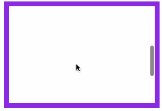
HTML
<style>
    body {
        padding: 50px;
    }
    main {
        width: 300px;
        height: 200px;
        border: solid 10px blueviolet;
        position: relative;
        overflow: scroll;
    }
    main article {
        height: 600px;
    }
    main article div {
        width: 200px;
        height: 200px;
        position: absolute;
    }
    main article div:nth-of-type(1) {
        background: red;
        left: 0px;
        z-index: 2;
    }
</style>
...

<main>
    <article>
        <div></div>
    </article>
</main>
图标定位
有了绝对定位我们可以很方便的控制元素在任何位置的摆放。
HTML
<style>
* {
    padding: 0;
    margin: 0;
}
main {
    height: 3000px;
    padding: 100px;
}
main div {
    width: 300px;
    border: solid 6px blueviolet;
    padding: 0;
    overflow: hidden;
    position: relative;
}
main div img {
    max-width: 300px;
    float: left;
}
main div span {
    display: inline-block;
    width: 30px;
    height: 30px;
    text-align: center;
    color: white;
    line-height: 2em;
    border-radius: 50%;
    background: blueviolet;
    position: absolute;
    top: 10px;
    left: 10px;
    box-shadow: 0 0 5px rgba(100, 100, 100, 0.8);
}
</style>
...

<main>
    <div>
        <span>热</span>
        <img src="banmashou.jpg" alt="">
    </div>
</main>
纵向重叠
如果元素重叠在一起,可以使用 z-index 控制元素的上下层级,数值越大越在上面。
父级子元素设置 z-index 没有意义,子元素永远在父元素上面的。
层级改变

HTML
<style>
body {
padding: 50px;
}
article {
width: 200px;
height: 200px;
border: solid 10px blueviolet;
position: relative;
cursor: pointer;
}
article:hover div:nth-of-type(2) {
z-index: 2;
}
article div {
width: 200px;
height: 200px;
position: absolute;
}
article div:nth-of-type(1) {
background: red;
left: 0px;
z-index: 2;
}
article div:nth-of-type(2) {
background: green;
left: 50px;
top: 50px;
}
</style>
...
<article>
<div></div>
<div></div>
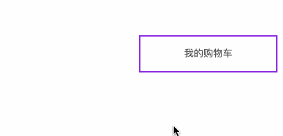
</article>购物车
因为事件捕获特性,所要以把父级的 z-index 放在最下面。
HTML
<style>
    * {
        padding: 0;
        margin: 0;
    }
    main {
        width: 600px;
        padding: 100px;
        margin: 0 auto;
    }
    main article {
        width: 150px;
        position: relative;
        cursor: pointer;
        font-size: 14px;
        color: #555;
    }
    main article:hover div:nth-of-type(1) {
        border-bottom: none;
    }
    main article:hover div:nth-of-type(2) {
        display: block;
    }
    main article div {
        box-sizing: border-box;
        height: 50px;
        line-height: 3.5em;
        text-align: center;
        border: solid 2px blueviolet;
        background: white;
    }
    main article div:nth-of-type(1) {
        position: relative;
        z-index: 2;
    }
    main article div:nth-of-type(2) {
        display: none;
        position: absolute;
        right: 0;
        top: 48px;
        left: -150px;
        z-index: 1;
    }
</style>
...

<main>
    <article>
        <div>我的购物车</div>
        <div>购物车中暂无产品</div>
    </article>
</main>
固定定位
元素相对于页面固定定位在某个位置,固定定位元素不会在滚动时改变位置 ,使用position: fixed 产生固定定位。

HTML
<style>
header {
height: 60px;
border-bottom: solid 5px #7f35c9;
box-shadow: 0 5px 8px rgba(100, 100, 100, 0.6);
position: fixed;
top: 0px;
left: 0px;
right: 0px;
}
article {
height: 3000px;
margin-top: 80px;
background: #f3f3f3;
border: solid 5px #ddd;
}
</style>
...
<header></header>
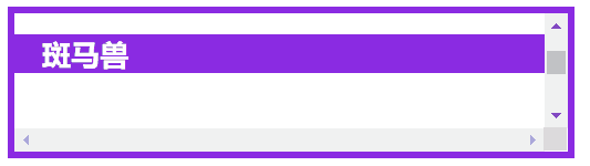
<article></article>粘性定位
同级定位
HTML
<style>
* {
padding: 0;
margin: 0;
}
main {
padding: 30px;
font-size: 14px;
}
main article {
width: 400px;
height: 100px;
border: solid 5px blueviolet;
overflow: scroll;
}
main article h2 {
background: #db1f77;
color: white;
text-indent: 20px;
position: sticky;
top: 0;
}
main article h2:nth-of-type(1) {
background: blueviolet;
}
main article section {
height: 300px;
}
</style>
...
<main>
<article>
<section></section>
<h2>斑马兽</h2>
<section></section>
<h2>banmashou</h2>
<section></section>
</article>
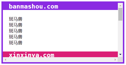
</main>非同级定位
不属于同一个父元素设置粘性定位时,后面的元素挤掉原来位置的元素。
HTML
<style>
    * {
        padding: 0;
        margin: 0;
    }
    main {
        padding: 30px;
        font-size: 14px;
    }
    main article {
        width: 400px;
        border: solid 5px blueviolet;
        height: 200px;
        overflow: scroll;
    }
    main article section:nth-of-type(odd) h2 {
        background: blueviolet;
    }
    main article section h2 {
        background: #db1f77;
        color: white;
        text-indent: 20px;
        position: sticky;
        top: 0;
    }
    main article section p {
        padding: 20px;
    }
</style>
...

<main>
    <article>
        <section>
            <h2>斑马兽</h2>
            <p>
                banmashou.com
            </p>
        </section>
        <section>
            <h2>欣欣吖</h2>
            <p>
                xinxinya.com
            </p>
        </section>
        <section>
            <h2>baidu.com</h2>
            <p>
                百度
            </p>
        </section>
    </article>
</main>