Appearance
媒体查询
媒体查询
Media Queries 能在不同的条件下使用不同的样式,使页面在不同在终端设备下达到不同的渲染效果。
viewport
手机是在电脑后出现的,早期网页设置没有考虑到手机的存在。把一个电脑端访问的网页拿到手机上浏览,我们需要告诉手机该怎么做。
我们不能让手机浏览器使用 PC 端的分辨率来展示网页,这会让高分辨率的手机上造成文字过小。
使用 viewport 可以将手机物理分辨率合理转为浏览器分辨率。
viewport 是虚拟窗口,虚拟窗口大于手机的屏幕尺寸。手机端浏览器将网页放在这个大的虚拟窗口中,我们就可以通过拖动屏幕看到网页的其他部分。
但有时需要控制 viewport 虚拟窗口的尺寸或初始的大小,比如希望 viewport 完全和屏幕尺寸一样宽。就需要学习 viewport 的知识了。
媒体设备
下面是常用媒体类型,当然主要使用的还是 screen
| 选项 | 说明 |
|---|---|
| all | 所有媒体类型 |
| screen | 用于电脑屏幕,平板电脑,智能手机等 |
| 打印设备 | |
| speech | 应用于屏幕阅读器等发声设备 |
注:tty, tv, projection, handheld, braille, embossed, aural 设备类型已经被废弃
- 可以使用 link 与 style 中定义媒体查询
- 也可以使用
@import url(screen.css) screen形式媒体使用的样式 - 可以用逗号分隔同时支持多个媒体设备
- 未指定媒体设备时等同于 all
style
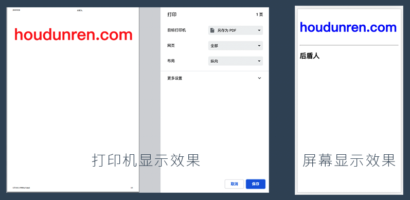
下面是在屏幕显示与打印设备上不同的 CSS 效果
<head>
    <meta charset="UTF-8">
    <meta name="viewport" content="width=device-width, initial-scale=1.0">
    <title>斑马兽</title>
    <style media="screen">
        h1 {
            font-size: 3em;
            color: blue;
        }
    </style>
    <style media="print">
        h1 {
            font-size: 8em;
            color: red;
        }

        h2,
        hr {
            display: none;
        }
    </style>
</head>

<body>
    <h1>banmashou.com</h1>
    <hr>
    <h2>斑马兽</h2>
</body>
link
在 link 标签中通过 media 属性可以设置样式使用的媒体设备。
common.css没有指定媒体所以全局应用screen.css应用在屏幕设备print.css应用在打印设备
<head>
    <meta charset="UTF-8">
    <meta name="viewport" content="width=device-width, initial-scale=1.0">
    <title>斑马兽</title>
    <link rel="stylesheet" href="common.css">
    <link rel="stylesheet" href="screen.css" media="screen">
    <link rel="stylesheet" href="print.css" media="print">
</head>

<body>
    <h1>banmashou.com</h1>
    <hr>
    <h2>斑马兽</h2>
</body>
common.css
h1 {
    outline: solid 5px #e74c3c;
}
screen.css
h1 {
    font-size: 3em;
    color: blue;
}
print.css
h1 {
    font-size: 8em;
    color: red;
}

h2,hr {
    display: none;
}
可以在 CSS 文件中使用 @media 再定义媒体样式
@import
使用@import 可以引入指定设备的样式规则。文件中引入一个样式文件,在这个文件中再引入其他媒体的样式文件。
<link rel="stylesheet" href="style.css">style.css
@import url(screen.css) screen;
@import url(print.css) print;
具体的 screen.css 与 print.css 与上面介绍的一样,在这里就不重复罗列了
@media
可以使用 @media 做到更细的控制,即在一个样式表中为多个媒体设备定义样式。
<head>
    <meta charset="UTF-8">
    <meta name="viewport" content="width=device-width, initial-scale=1.0">
    <title>斑马兽</title>
    <style>
        @media screen {
            h1 {
                font-size: 3em;
                color: blue;
            }
        }

        @media print {
            h1 {
                font-size: 8em;
                color: red;
            }

            h2,
            hr {
                display: none;
            }
        }
    </style>
</head>

<body>
    <h1>banmashou.com</h1>
    <hr>
    <h2>斑马兽</h2>
</body>
多设备支持
可以用逗号分隔同时支持多个媒体设备。
@import url(screen.css) screen,print;

<link rel="stylesheet" href="screen.css" media="screen,print">

@media screen,print {...}
设备方向
使用 orientation 属性可以定义设备的方向
| 值 | 说明 |
|---|---|
| portrait | 竖屏设备即高度大于宽度 |
| landscape | 横屏设备即宽度大于高度 |
下面是尺寸小于 768px 或是横屏时使用蓝色字体
<style media="screen and (min-width: 768px),screen and (orientation:landscape)">
  body {
    color: blue;
  }
</style>
<h1>baidu</h1>
查询条件
可以使用不同条件限制使用的样式
- 条件表达式需要放在扩号中
逻辑与
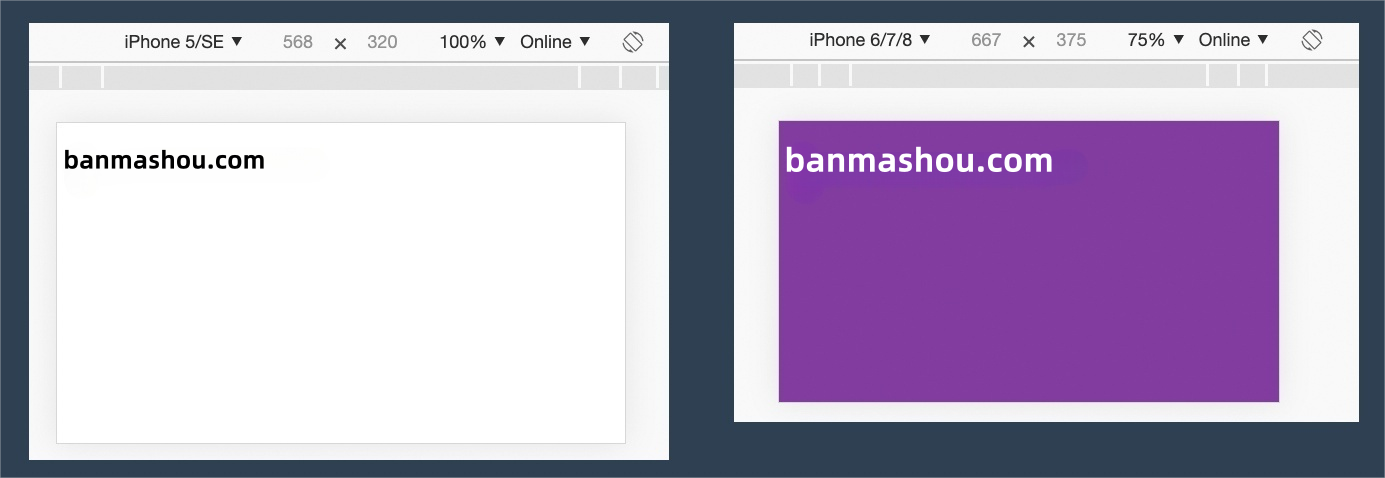
需要满足多个条件时才使用样式,多个条件使用and 连接。下例中满足以下要求才使用样式。
- 横屏显示
- 宽度不能超过 600px
<head>
    <meta charset="UTF-8">
    <meta name="viewport" content="width=device-width, initial-scale=1.0">
    <title>斑马兽</title>
    <style>
        @media screen and (orientation: landscape) and (max-width: 600px) {
            body {
                background: #8e44ad;
            }

            h1 {
                font-size: 3em;
                color: white;
            }
        }
    </style>
</head>

<body>
    <h1>banmashou.com</h1>
</body>
逻辑或
多个或 条件查询使用逗号连接,不像其他程序中使用 or 语法。
下面的示例中如果设备是横屏显示或宽度不超 600px 时就使用样式规则。
<head>
    <meta charset="UTF-8">
    <meta name="viewport" content="width=device-width, initial-scale=1.0">
    <title>斑马兽</title>
    <style>
        @media screen and (orientation: landscape),
        screen and (max-width: 600px) {
            body {
                background: #8e44ad;
            }

            h1 {
                font-size: 3em;
                color: white;
            }
        }
    </style>
</head>

<body>
    <h1>banmashou.com</h1>
</body>
不应用
not 表示不应用样式,即所有条件都满足时不应用样式。
- 必须将 not 写在查询的最前面
<head>
    <meta charset="UTF-8">
    <meta name="viewport" content="width=device-width, initial-scale=1.0">
    <title>斑马兽</title>
    <style>
        @media not screen and (orientation: landscape) and (max-width:600px) {
            body {
                background: #8e44ad;
            }

            h1 {
                font-size: 3em;
                color: white;
            }
        }
    </style>
</head>

<body>
    <h1>banmashou.com</h1>
</body>
only
用来排除不支持媒体查询的浏览器。
- 对支持媒体查询的设备,正常调用样式,此时就当 only 不存在
- 对不支持媒体查询的设备不使用样式
- only 和 not 一样只能出现在媒体查询的开始
@media only screen and (orientation: landscape) and (max-width: 600px) {
	...
}
查询特性
根据查询特性筛选出使用样式的设备。
常用特性
下面列出常用的媒体查询特性
| 特性 | 说明 |
|---|---|
| orientation: landscape | portrait | landscape 横屏,portrait 竖屏 |
| width | 设备宽度 |
| height | 设备高度 |
| min-width | 最小宽度 |
| max-width | 最大宽度 |
| min-height | 最小高度 |
| max-height | 最大高度 |
使用示例
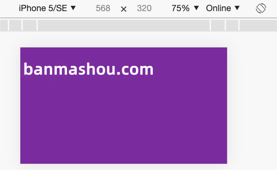
在设备宽度为 568px 时使用样式
@media only screen and (width:568px) {
...
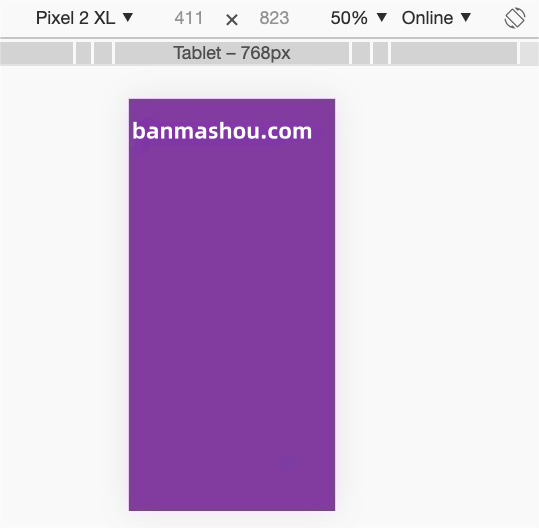
}在设备不小于 569px 时使用样式
@media only screen and (min-width:569px) {
	...
}
橫屏设备并且宽度大于 569px 时使用样式
@media only screen and (orientation: landscape) and (min-width:569px) {
	...
}