Appearance
浮动布局
浮动布局
float 属性定义元素在哪个方向浮动。以往这个属性总应用于图像,使文本围绕在图像周围,不过在 CSS 中,任何元素都可以浮动。浮动元素会生成一个块级框,而不论它本身是何种元素。
在网站开发中需要一行排列多个元素,使用浮动可以方便实现。下面是使用浮动排列多个元素
float
使用浮动可以控制相邻元素间的排列关系。
| 选项 | 说明 |
|---|---|
| left | 向左浮动 |
| right | 向右浮动 |
| none | 不浮动 |
文档流
没有设置浮动的块元素是独占一行的。

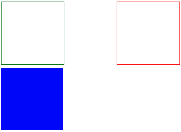
浮动是对后面元素的影响,下图中第二个元素设置浮动对第一个元素没有影响
CSS
div:first-of-type {
    border: solid 2px red;
}

div:last-of-type {
 	float: left;
    background: green;
}
丢失空间
如果只给第一个元素设置浮动,第二个元素不设置,后面的元素会占用第一个元素空间。

CSS
div:first-of-type {
    float: left;
    border: solid 2px red;
}

div:last-of-type {
    background: green;
}
使用浮动
两个元素都设置浮动后,会并排显示

CSS
div:first-of-type {
    float: left;
    border: solid 2px red;
}

div:last-of-type {
    float: left;
    background: green;
}
为第二个元素设置右浮动时将移动到右边

CSS
div:first-of-type {
    float: left;
    border: solid 2px red;
}

div:last-of-type {
    float: right;
    background: green;
}
浮动边界
浮动元素边界不能超过父元素的 padding

CSS
main {
    width: 400px;
    border: solid 2px black;
    overflow: auto;
    padding: 50px;
    background-color: antiquewhite;
    background-clip: content-box;
}

div {
    width: 100px;
    height: 100px;
    box-sizing: border-box;
}

div:first-of-type {
    float: left;
    border: solid 2px red;
}

div:last-of-type {
    float: right;
    background: green;
}
浮动转块
元素浮动后会变为块元素包括行元素如 span,所以浮动后的元素可以设置宽高
CSS
a {
    float: left;
    width: 300px;
}
清除浮动
不希望元素受浮动元素影响时,可以清除浮动。
clear
CSS 提供了 clear 规则用于清除元素浮动影响。
| 选项 | 说明 |
|---|---|
| left | 左边远离浮动元素 |
| right | 右连远离浮动元素 |
| both | 左右都远离浮动元素 |
使用清除浮动
HTML
<style>
    div {
        width: 200px;
        height: 200px;
        margin-bottom: 10px;
    }

    div.green {
        border: solid 2px green;
        float: left;
    }

    div.red {
        border: solid 2px red;
        float: right;
    }

    div.blue {
        background: blue;
        clear: both;
    }
</style>
...

<div class="green"></div>
<div class="red"></div>
<div class="blue"></div>在父元素内部最后面添加一个没有高度的了元素,并使用clear:both 。
HTML
<style>
    .clearfix {
        clear: both;
        height: 0;
    }

    div {
        width: 200px;
        height: 200px;
        margin-bottom: 10px;
    }


    div.green {
        border: solid 2px green;
        float: left;
    }

    div.red {
        border: solid 2px red;
        height: 200px;
        float: left;
    }

    div.blue {
        background: blue;
    }
</style>

<article>
    <div class="green"></div>
    <div class="red"></div>
    <div class="clear"></div>
</article>
<div class="blue"></div>
after
使用 ::after 伪类为父元素添加后标签,实现清除浮动影响。
CSS
.clearfix::after {
    content: "";
    display: block;
    clear: both;
}
overflow
子元素使用浮动后将不占用空间,这时父元素高度为将为零。通过添加父元素并设置 overflow 属性可以清除浮动。
将会使用父元素产生 BFC 机制,即父元素的高度计算会包括浮动元素的高度。
CSS
article {
    overflow: hidden;
}
...
页面布局

完成页面布局注意以下几点
- 首先根据设计稿确定页面大小(主要指宽度,移动端不需要考虑),如 1200px 宽度
- 水平分割页面主要区域
- 每个区域中按以上两步继续细分
父容器
一组浮动元素要放在一个父容器中,如下图绿线指父容器,里面的红线为浮动子元素。
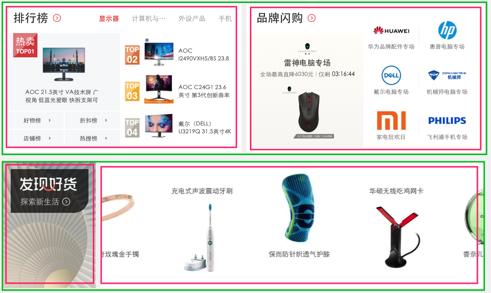
下面是上图的布局结构代码
HTML
<style>
    article {
        background: #f3f3f3;
        width: 1020px;
        height: auto;
        overflow: auto;
        padding: 20px;
    }

    article.hot section {
        background: #fff;
        box-shadow: 0 0 5px #777;
        height: 300px;
        width: 500px;
    }

    article.hot section:first-of-type {
        float: left;
    }

    article.hot section:last-of-type {
        float: right;
    }

    article.swiper section {
        height: 200px;
        background: #fff;
        box-shadow: 0 0 5px #777;
    }

    article.swiper section:first-of-type {
        width: 200px;
        float: left;
    }

    article.swiper section:last-of-type {
        width: 820px;
        float: left;
    }
</style>
...

 <article class="hot">
        <section></section>
        <section></section>
</article>
<article class="swiper">
        <section></section>
        <section></section>
</article>
形状浮动
通过形状浮动可以让内容围绕图片,类似于我们在 word 中的环绕排版。要求图片是有透明度的 PNG 格式。
距离控制
| 选项 | 说明 |
|---|---|
| margin-box | 外边距环绕 |
| padding-box | 内边距环绕 |
| border-box | 边线环绕 |
| content-box | 内容环绕 |
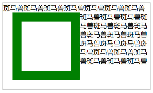
外边距环绕
HTML
<style>
span.shape {
float: left;
width: 100px;
height: 100px;
padding: 30px;
margin: 30px;
border: solid 30px green;
shape-outside: margin-box;
}
</style>
...
<p>
<span class="shape"></span>
斑马兽斑马兽斑马兽斑马兽斑马兽斑马兽斑马兽斑马兽斑马兽斑马兽斑马兽斑马兽斑马兽斑马兽斑马兽斑马兽斑马兽斑马兽斑马兽斑马兽斑马兽斑马兽斑马兽斑马兽斑马兽斑马兽斑马兽斑马兽斑马兽斑马兽斑马兽斑马兽斑马兽斑马兽斑马兽斑马兽斑马兽斑马兽斑马兽斑马兽斑马兽斑马兽斑马兽斑马兽斑马兽斑马兽斑马兽斑马兽斑马兽斑马兽斑马兽斑马兽
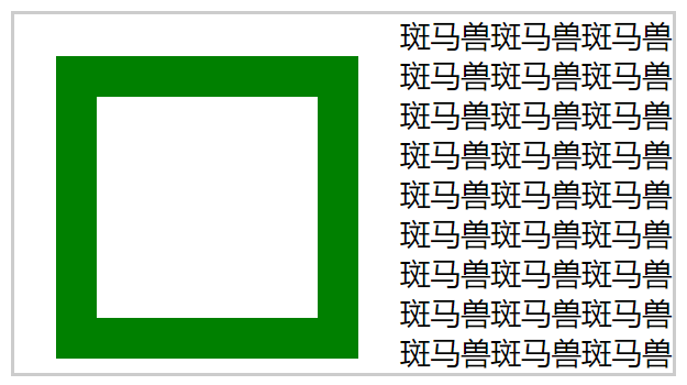
</p>边框环绕
CSS
span.shape {
    float: left;
    width: 100px;
    height: 100px;
    padding: 30px;
    margin: 30px;
    border: solid 30px green;
    shape-outside: border-box;
}
显示区域
| 选项 | 说明 |
|---|---|
| circle | 圆形 |
| ellipse | 椭圆 |
| polygon | 多边形 |
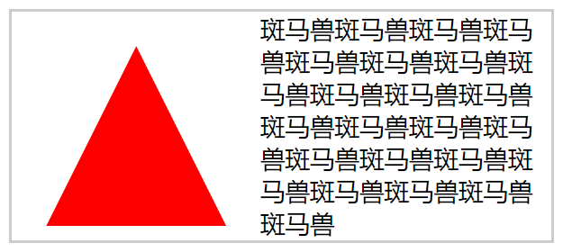
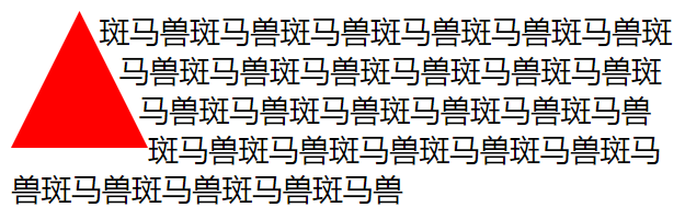
圆形

CSS
span.shape {
    float: left;
    width: 100px;
    height: 100px;
    padding: 30px;
    margin: 30px;
    background: red;
    clip-path: circle(50% at center);
}
椭圆
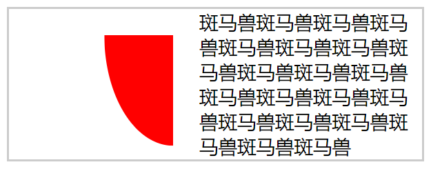
CSS
span.shape {
    float: left;
    width: 100px;
    height: 100px;
    padding: 30px;
    margin: 30px;
    background: red;
    clip-path: ellipse(50% 80% at 100% 0);
}
多边形
CSS
span.shape {
    float: left;
    width: 100px;
    height: 100px;
    padding: 30px;
    margin: 30px;
    background: red;
    clip-path: polygon(50% 0, 100% 100%, 0 100%)
}
内移距离
使用 inset 属性控制环绕向内移动的距离。
CSS
span.shape {
    float: left;
    width: 100px;
    height: 100px;
    padding: 30px;
    margin: 30px;
    background: red;
    shape-outside: inset(50px 30px 80px 50px) padding-box;
}
环绕模式
| 选项 | 说明 |
|---|---|
| circle | 圆形环绕 |
| ellipse | 椭圆环绕 |
| url | 图片环绕 |
| polygan | 多边环绕 |
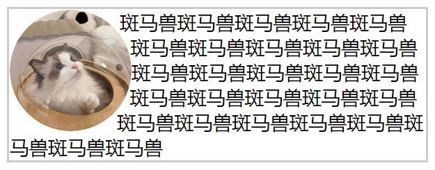
圆形环绕

CSS
img {
    padding: 20px;
    float: left;
    shape-outside: circle(50%) padding-box;
}
椭圆环绕
CSS
img {
    padding: 20px;
    float: left;
    shape-outside: ellipse(80px 70px) padding-box;
}
图片环绕
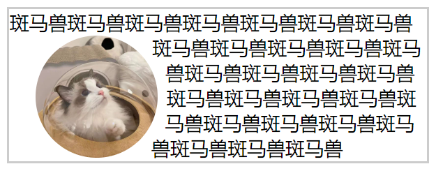
CSS
img {
    float: left;
    shape-outside: url(bm.png);
}
多边环绕
CSS
span.shape {
    float: left;
    width: 100px;
    height: 100px;
    background: red;
    clip-path: polygon(50px 0px, 0 100px, 100px 100px);
    shape-outside: polygon(50px 0px, 0 100px, 100px 100px);
}