Appearance
过渡延迟
基础知识
默认情况下 CSS 属性的变化是瞬间完成的(其实也有时间只是毫秒级的,人眼很难感知到),而使用本章节学习的 CSS 过渡可以控制让变化过程平滑。
有关变形动画已经讲的很丰富了,请在斑马兽文档查看相应章节。
动画属性
不是所有 css 属性都有过渡效果,查看支持动画的 CSS 属性,一般来讲有中间值的属性都可以设置动画如宽度、透明度等。
案例分析
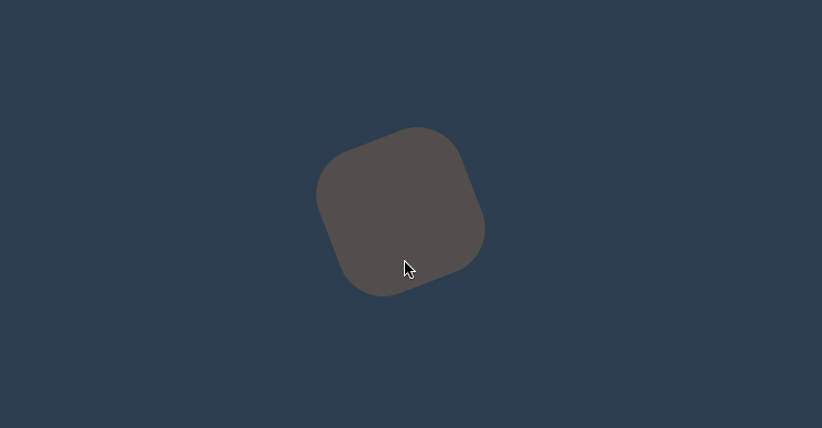
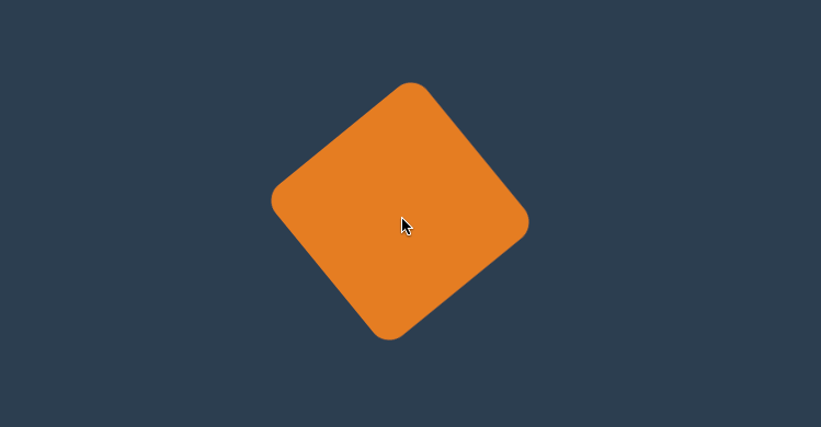
下面例子中边框的变化是没有中间值的,所以没有过渡效果。但线宽度是数值类型有中间值所以会有过渡效果。
<style>
* {
padding: 0;
margin: 0;
}
body {
background: #2c3e50;
display: flex;
flex-direction: column;
justify-content: center;
align-items: center;
box-sizing: border-box;
width: 100vw;
height: 100vh;
padding: 80px;
}
main {
width: 400px;
height: 400px;
}
div {
width: 150px;
height: 150px;
background-color: #fff;
border: solid 20px #ddd;
transition: 2s;
}
div:hover {
border-radius: 50%;
border: dotted 60px #ddd;
background-color: #e67e22;
}
</style>
<main>
<div></div>
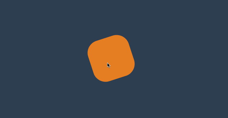
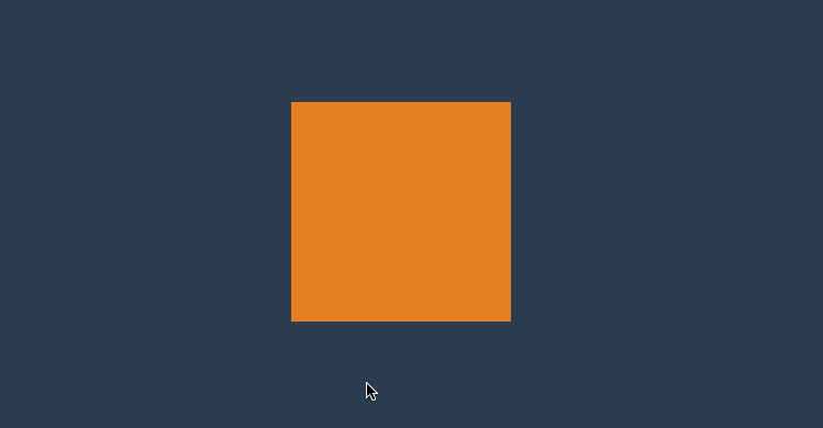
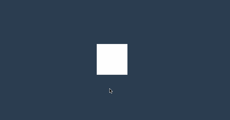
</main>元素状态
初始形态
指当页面加载后的样式状态,下面是表单设置的初始样式。

<style>
    * {
        padding: 0;
        margin: 0;
    }

    body {
        background: #2c3e50;
        display: flex;
        flex-direction: column;
        justify-content: center;
        align-items: center;
        box-sizing: border-box;
        width: 100vw;
        height: 100vh;
        padding: 20px;
    }

    input {
        border: solid 5px #e67e22;
        height: 60px;
        width: 100%;
        margin-bottom: 20px;
    }

    input:checked {
        position: relative;
        width: 60px;
        height: 60;
        border: none;
    }

    input:checked::before {
        content: '⩗';
        color: white;
        display: flex;
        justify-content: center;
        align-items: center;
        font-size: 3em;
        position: absolute;
        left: 0;
        top: 0;
        right: 0;
        bottom: 0;
        box-sizing: border-box;
        background: #3498db;
    }
</style>

<input type="text">
<input type="checkbox" checked>
变化形态
指元素由初始状态变化后的状态,比如鼠标放上、表单获得焦点后的形态。
<style>
    * {
        padding: 0;
        margin: 0;
    }

    body {
        background: #2c3e50;
        display: flex;
        flex-direction: column;
        justify-content: center;
        align-items: center;
        box-sizing: border-box;
        width: 100vw;
        height: 100vh;
         padding: 20px;
    }

    input {
        border: solid 5px #e67e22;
        height: 60px;
        width: 100%;
        margin-bottom: 20px;
        transition: 2s;
    }

    input:hover {
        border: solid 5px #000 !important;
    }

    input:focus {
        background: #e67e22;
    }

    input:checked {
        position: relative;
        width: 60px;
        height: 60;
        border: none;
    }

    input:checked::before {
        content: '⩗';
        color: white;
        display: flex;
        justify-content: center;
        align-items: center;
        font-size: 3em;
        position: absolute;
        left: 0;
        top: 0;
        right: 0;
        bottom: 0;
        box-sizing: border-box;
        background: #3498db;
    }
</style>

<input type="text">
<input type="checkbox" checked>
transition-property
用于设置哪些属性应用过渡效果。
- 默认值为
all即所有属性都发生过渡效果 - 多个属性使用逗号分隔
属性设置
<style>
    * {
        padding: 0;
        margin: 0;
    }

    body {
        background: #2c3e50;
        display: flex;
        flex-direction: column;
        justify-content: center;
        align-items: center;
        box-sizing: border-box;
        width: 100vw;
        height: 100vh;
        padding: 80px;
    }

    main {
        width: 400px;
        height: 400px;
    }

    div {
        width: 150px;
        height: 150px;
        background-color: #e67e22;
        border-radius: 50%;
        transition-property: background-color, transform, opacity, border-radius;
        transition-duration: 3s;
    }

    main:hover div {
        border-radius: 0;
        transform: scale(2) rotate(180deg);
        background-color: #e67e22;
    }
</style>

<main>
	<div></div>
</main>
禁用属性
<style>
* {
padding: 0;
margin: 0;
}
body {
background: #2c3e50;
display: flex;
flex-direction: column;
justify-content: center;
align-items: center;
box-sizing: border-box;
width: 100vw;
height: 100vh;
padding: 80px;
}
main {
width: 400px;
height: 400px;
}
div {
width: 200px;
height: 200px;
background: #e74c3c;
transition-property: background, transform;
transition-duration: 2s;
margin-bottom: 50px;
}
main:hover div{
transform: scale(1.5) rotate(180deg);
background: #9b59b6;
}
div:last-child {
transition-property: none;
}
</style>
<main>
<div></div>
<div></div>
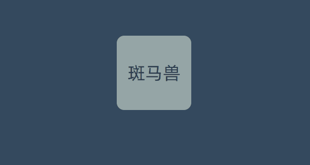
</main>transitionend
用于控制过渡结束后执行的 JS 事件,简写属性会触发多次如 border-radius 会触发四次事件,不难理解因为可以为border-bottom-left-radius 等四个属性独立设置过渡,所以就会有四次事件。
| 属性 | 说明 |
|---|---|
| propertyName | 结束过渡样式 |
| elapsedTime | 过渡需要的时间 |
| pseudoElement | 过渡的伪元素 |
| isTrusted | true:用户触发,false:脚本触发 |
<style>
    * {
        padding: 0;
        margin: 0;
    }

    body {
        width: 100vw;
        height: 100vh;
        background: #34495e;
        display: flex;
        justify-content: center;
        align-items: center;
    }

    main {
        width: 400px;
        height: 400px;
    }

    div {
        width: 200px;
        height: 200px;
        position: relative;
        display: flex;
        flex-direction: column;
        align-items: center;
        justify-content: center;
        flex-wrap: nowrap;
    }

    div::before {
        content: '斑马兽';
        font-size: 3em;
        color: #2c3e50;
        background: #95a5a6;
        width: 200px;
        height: 200px;
        display: flex;
        justify-content: center;
        align-items: center;
        border-radius: 10%;
        transition-duration: 2s;
        cursor: pointer;
    }

    div:hover::before {
         transition-duration: 1.5s;
				 border-radius: 50%;
				 background: #f1c40f;
         transform: rotate(360deg);
    }

    div::after {
        content: 'banmashou.com';
        text-transform: uppercase;
        position: absolute;
        bottom: -60px;
        font-size: 2em;
        color: #95a5a6;
        text-align: center;
        transform: translateX(-999px) skew(45deg);
        transition-duration: 1s;
    }

    div.move::after {
        transform: translateX(0px) skew(0deg);
    }
</style>

<main>
    <div>

    </div>
</main>
<script>
    document.querySelector('div').addEventListener('transitionend', function (e) {
        console.log(e);
        document.querySelector('div').className = 'move';
    })
</script>
transition-duration
用于设置过渡时间,需要注意以下几点
- 可使用单位为 ms 毫秒、s 秒
- 默认值为 0s 不产生过渡效果
- 一个值时,所有属性使用同样的时间
- 二个值时,奇数属性使用第一个,偶数属性使用第二个
- 变化属性数量大于时间数量时,后面的属性再从第一个时间开始重复使用
统一时间
<style>
    * {
        padding: 0;
        margin: 0;
    }

    body {
        background: #2c3e50;
        display: flex;
        flex-direction: column;
        justify-content: center;
        align-items: center;
        box-sizing: border-box;
        width: 100vw;
        height: 100vh;
        padding: 80px;
    }

    main {
        width: 400px;
        height: 400px;
    }

    div {
        width: 150px;
        height: 150px;
        background-color: #34495e;
        border-radius: 50%;
        opacity: 0.2;
        transition-property: background-color, transform, opacity, border-radius;
        transition-duration: 3s;
    }

    div:hover {
        opacity: 1;
        border-radius: 0;
        transform: scale(2) rotate(180deg);
        background-color: #e67e22;
    }
</style>

<main>
	<div></div>
</main>
两个时间
下面共有四个属性并设置了两个时间值,1,3 属性使用第一个值,2,4 属性使用第二个值。
...
div {
  width: 150px;
  height: 150px;
  background-color: #34495e;
  border-radius: 50%;
  opacity: 0.2;
  transition-property: background-color, transform, opacity, border-radius;
  transition-duration: 200ms, 5s;
}
...
多个时间
下面共有四个属性并设置了三个时间值,1,2,3 属性使用 1,2,3 时间值,第四个属性再从新使用第一个时间值。
...
div {
  width: 150px;
  height: 150px;
  background-color: #34495e;
  border-radius: 50%;
  opacity: 0.2;
  transition-property: background-color, transform, opacity, border-radius;
  transition-duration: 200ms, 5s, 2s;
}
...
不同时间
可以为初始与变化状态设置不同的时间。
下面是将hover 设置为 3s,当鼠标放上时变化时间为 3s。为初始设置为 1s 即表示变化到初始状态需要 1s。
<style>
    * {
        padding: 0;
        margin: 0;
    }

    body {
        background: #2c3e50;
        display: flex;
        flex-direction: column;
        justify-content: center;
        align-items: center;
        box-sizing: border-box;
        width: 100vw;
        height: 100vh;
        padding: 80px;
    }

    main {
        width: 400px;
        height: 400px;
    }

    div {
        width: 150px;
        height: 150px;
        background-color: #e67e22;
        border-radius: 50%;
        transition-property: background-color, transform, opacity, border-radius;
        transition-duration: 1s;
    }

    div:hover {
        border-radius: 0;
        transform: scale(2) rotate(180deg);
        background-color: #e67e22;
        transition-duration: 3s;
    }
</style>

<main>
	<div></div>
</main>
transition-timing-function
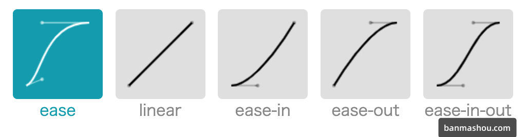
用于设置过渡效果的速度,可在 https://cubic-bezier.com网站在线体验效果差异。
默认参数
| 值 | 描述 |
|---|---|
| linear | 规定以相同速度开始至结束的过渡效果(等于 cubic-bezier(0,0,1,1))。 |
| ease | 开始慢,然后快,慢下来,结束时非常慢(cubic-bezier(0.25,0.1,0.25,1)) |
| ease-in | 开始慢,结束快(等于 cubic-bezier(0.42,0,1,1)) |
| ease-out | 开始快,结束慢(等于 cubic-bezier(0,0,0.58,1)) |
| ease-in-out | 中间快,两边慢(等于 cubic-bezier(0.42,0,0.58,1)) |
| cubic-bezier(n,n,n,n) | 在 cubic-bezier 函数中定义自己的值 |
<style>
    * {
        padding: 0;
        margin: 0;
    }

    body {
        background: #2c3e50;
        display: flex;
        flex-direction: column;
        justify-content: center;
        align-items: center;
        box-sizing: border-box;
        width: 100vw;
        height: 100vh;
        padding: 80px;
    }

    main {
        width: 400px;
        height: 400px;
    }

    div {
        width: 150px;
        height: 150px;
        background-color: #e67e22;
        border-radius: 50%;
        transition-property: background-color, transform, opacity, border-radius;
        transition-duration: 3s;
        transition-timing-function: ease;
    }

    div:hover {
        border-radius: 0;
        transform: scale(2) rotate(180deg);
        background-color: #e67e22;
    }
</style>

<main>
	<div></div>
</main>
贝塞尔曲线
需要设置四个值 cubic-bezier(<x1>, <y1>, <x2>, <y2>),来控制曲线速度,可在 https://cubic-bezier.com 网站在线体验效果。
...
div {
  width: 150px;
  height: 150px;
  background-color: #e67e22;
  border-radius: 50%;
  transition-property: background-color, transform, opacity, border-radius;
  transition-duration: 3s;
  transition-timing-function: cubic-bezier(.17, .67, .86, .49);
}
...
步进速度
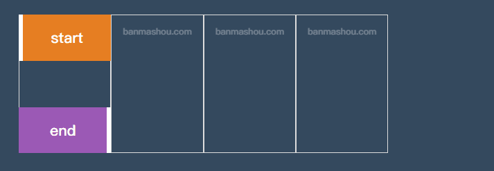
过渡使用阶梯化呈现,有点像现实生活中的机械舞,下面是把过渡分五步完成。
| 选项 | 说明 |
|---|---|
| steps(n,start) | 设置 n 个时间点,第一时间点变化状态 |
| steps(n,end) | 设置 n 个时间点,第一时间点初始状态 |
| step-start | 等于 steps(1,start),可以理解为从下一步开始 |
| step-end | 等于 steps(1,end),可以理解为从当前步开始 |
steps
<head>
<style>
body {
width: 100vw;
height: 100vh;
display: flex;
justify-content: center;
align-items: center;
background: #34495e;
}
ul {
width: 800px;
height: 300px;
list-style: none;
display: flex;
justify-content: space-between;
position: relative;
}
li {
flex: 1;
border: solid 1px #ddd;
text-align: center;
padding-top: 20px;
}
li::before {
content: 'banmashou.com';
font-size: 1.2em;
text-align: center;
color: white;
opacity: .3;
}
ul::before,
ul::after {
text-align: center;
font-size: 2em;
line-height: 100px;
color: white;
z-index: 2;
}
ul::before {
content: 'start';
position: absolute;
width: 200px;
height: 100px;
background: #e67e22;
transition-duration: 2s;
transition-timing-function: steps(4, start);
box-sizing: border-box;
border-left: solid 10px #fff;
}
ul::after {
content: 'end';
position: absolute;
bottom: 0;
width: 200px;
height: 100px;
background: #9b59b6;
transition-duration: 2s;
transition-timing-function: steps(4, end);
box-sizing: border-box;
border-right: solid 10px #fff;
}
ul:hover::before {
transform: translateX(800px);
}
ul:hover::after {
transform: translateX(800px);
}
</style>
</head>
<body>
<ul>
<li></li>
<li></li>
<li></li>
<li></li>
</ul>
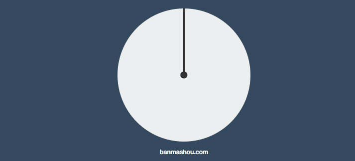
</body>时钟效果
<head>
    <style>
        body {
            width: 100vw;
            height: 100vh;
            display: flex;
            flex-direction: column;
            justify-content: center;
            align-items: center;
            background: #34495e;
        }

        main {
            width: 400px;
            height: 400px;
            background: #ecf0f1;
            border-radius: 50%;
            position: relative;
        }

        main::before {
            content: '';
            width: 20px;
            height: 20px;
            background: #333;
            position: absolute;
            left: 50%;
            top: 50%;
            border-radius: 50%;
            transform: translate(-50%, -50%)
        }

        main::after {
            content: '';
            width: 5px;
            height: 50%;
            background: #333;
            position: absolute;
            left: 50%;
            bottom: 50%;
            transform: translateX(-50%);
            transform-origin: bottom;
            transition-duration: 60s;
            transition-timing-function: steps(60, end);
        }

        body:hover main::after {
            transform: translateX(-50%) rotate(360deg);
        }
    </style>
</head>

<body>
    <main>
    </main>
    <h3>banmashou.com</h3>
</body>
step-start/end
<head>
    <style>
        body {
            width: 100vw;
            height: 100vh;
            display: flex;
            justify-content: center;
            align-items: center;
            background: #34495e;
        }

        ul {
            width: 400px;
            height: 300px;
            list-style: none;
            display: flex;
            justify-content: space-between;
            position: relative;
        }

        li {
            flex: 1;
            border: solid 1px #ddd;
            text-align: center;
            padding-top: 20px;
        }

        li::before {
            content: 'banmashou.com';
            font-size: 1.2em;
            text-align: center;
            color: white;
            opacity: .3;
        }

        ul::before,
        ul::after {
            text-align: center;
            font-size: 2em;
            line-height: 100px;
            color: white;
            z-index: 2;
        }

        ul::before {
            content: 'start';
            position: absolute;
            width: 200px;
            height: 100px;
            background: #e67e22;
            transition-duration: 1s;
            transition-timing-function: step-start;
            box-sizing: border-box;
            border-left: solid 10px #fff;
        }

        ul::after {
            content: 'end';
            position: absolute;
            bottom: 0;
            width: 200px;
            height: 100px;
            background: #9b59b6;
            transition-duration: 1s;
            transition-timing-function: step-end;
            box-sizing: border-box;
            border-right: solid 10px #fff;
        }

        ul:hover::before {
            transform: translateX(200px);
        }

        ul:hover::after {
            transform: translateX(200px);
        }
    </style>
</head>

<body>
    <ul>
        <li></li>
        <li></li>
    </ul>
</body>
步进形态
<style>
    * {
        padding: 0;
        margin: 0;
    }

    body {
        background: #2c3e50;
        display: flex;
        flex-direction: column;
        justify-content: center;
        align-items: center;
        box-sizing: border-box;
        width: 100vw;
        height: 100vh;
        padding: 80px;
    }

    main {
        width: 400px;
        height: 400px;
    }

    div {
        width: 150px;
        height: 150px;
        background-color: #e67e22;
        border-radius: 50%;
        transition-property: background-color, transform, opacity, border-radius;
        transition-duration: 3s;
        transition-timing-function: steps(5, end);
    }

    div:hover {
        border-radius: 0;
        transform: scale(2) rotate(180deg);
        background-color: #e67e22;
    }
</style>

<main>
	<div></div>
</main
变化广告
<head>
    <style>
        body {
            width: 100vw;
            height: 100vh;
            display: flex;
            flex-direction: column;
            justify-content: center;
            align-items: center;
            background: #34495e;
        }

        main {
            width: 400px;
            height: 200px;
            position: relative;
            overflow: hidden;
        }

        section {
            width: 800px;
            height: 200px;
            display: flex;
            transition-duration: 1s;
            transition-timing-function: step-start;
        }

        div {
            width: 400px;
            height: 200px;
            overflow: hidden;
        }

        main:hover section {
            transform: translateX(-400px);
        }
    </style>
</head>

<body>
    <main>
        <section>
            <div><img src="3.jpg" alt=""></div>
            <div><img src="5.jpg" alt=""></div>
        </section>
    </main>
</body>
transition-delay
用于设置延迟过渡的时间。
- 默认为 0s 即立刻开始过渡
- 值可以为负数
- 变化属性数量大于时间数量时,后面的属性再从第一个时间开始重复使用
基本使用
下面设置了延迟时间为 1s,当鼠标放上
<style>
    * {
        padding: 0;
        margin: 0;
    }

    body {
        background: #2c3e50;
        display: flex;
        flex-direction: column;
        justify-content: center;
        align-items: center;
        box-sizing: border-box;
        width: 100vw;
        height: 100vh;
        padding: 80px;
    }

    main {
        width: 400px;
        height: 400px;
    }

    div {
        width: 150px;
        height: 150px;
        background-color: #e67e22;
        border-radius: 50%;
        transition-property: background-color, transform, opacity, border-radius;
        transition-duration: 1s;
        transition-delay: 1s;
    }

    div:hover {
        border-radius: 0;
        transform: scale(2) rotate(180deg);
        background-color: #e67e22;
    }
</style>

<main>
	<div></div>
</main>
多值延迟
可以设置不同属性的延迟时间。
<style>
    * {
        padding: 0;
        margin: 0;
    }

    body {
        background: #2c3e50;
        display: flex;
        flex-direction: column;
        justify-content: center;
        align-items: center;
        box-sizing: border-box;
        width: 100vw;
        height: 100vh;
        padding: 80px;
    }

    main {
        width: 400px;
        height: 400px;
    }

    div {
        width: 150px;
        height: 150px;
        background-color: #fff;

        transition-property: background-color, transform, border-radius;
        transition-duration: 1s, 2s, 3s;
        transition-delay: 1s, 3s, 5s;
    }

    div:hover {
        border-radius: 50%;
        transform: scale(2) rotate(180deg);
        background-color: #e67e22;
    }
</style>

<main>
	<div></div>
</main>
使用负值
下例圆角属性的过渡时间为 4s,设置延迟为 -4s,表示鼠标放上时直接显示在 4s 上的效果。如果设置为-2s 显示圆角变形一半的效果。
<style>
    * {
        padding: 0;
        margin: 0;
    }

    body {
        background: #2c3e50;
        display: flex;
        flex-direction: column;
        justify-content: center;
        align-items: center;
        box-sizing: border-box;
        width: 100vw;
        height: 100vh;
        padding: 80px;
    }

    main {
        width: 400px;
        height: 400px;
    }

    div {
        width: 150px;
        height: 150px;
        background-color: #fff;

        transition-property: background-color, transform, border-radius;
        transition-duration: 1s, 2s, 4s;
        transition-delay: 1s, 2s, -4s;
    }

    div:hover {
        border-radius: 50%;
        transform: scale(2) rotate(180deg);
        background-color: #e67e22;
    }
</style>

<main>
	<div></div>
</main>
transition
可以使用transition 指令将过渡规则统一设置,需要注意以下几点。
- 必须设置过渡时间
- 延迟时间放在逗号或结束前
transition: border-radius linear 2s 0s,
background 2s 2s,
width linear 2s 4s,
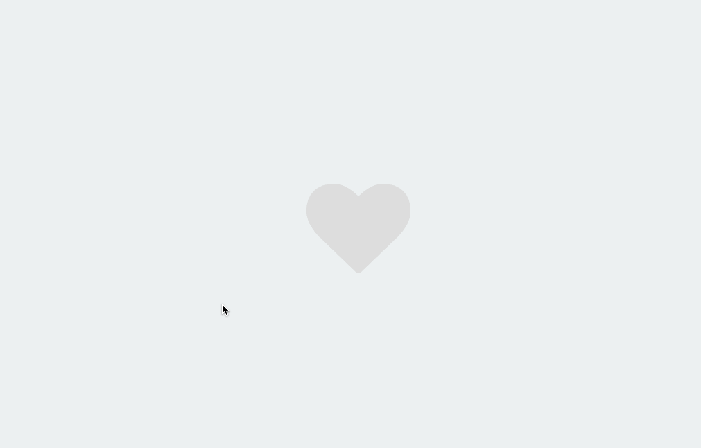
height linear 2s 4s;点赞案例
<link rel="stylesheet" href="https://maxcdn.bootstrapcdn.com/font-awesome/4.7.0/css/font-awesome.min.css">
<script src='https://code.jquery.com/jquery-3.3.1.slim.min.js'></script>
<style>
    body {
        width: 100vw;
        height: 100vh;
        display: flex;
        justify-content: center;
        align-items: center;
        background: #ecf0f1;
    }

    div {
        position: relative;
        width: 100px;
        height: 100px;
        cursor: pointer;
        display: flex;
        justify-content: center;
        align-items: center;
    }

    div i.fa {
        font-size: 100px;
        position: absolute;
        transition: all .5s;
        color: #ddd;
    }

    div.heart i.fa {
        font-size: 400px;
        color: #e74c3c;
        opacity: 0;
    }

    div.heart i.fa:nth-child(2) {
        font-size: 80px;
        color: #e74c3c;
        opacity: 1;
    }
</style>

<body>
    <div onclick="heart()">
        <i class="fa fa-heart" aria-hidden="true"></i>
        <i class="fa fa-heart" aria-hidden="true"></i>
    </div>
    <script>
        function heart() {
            $("div").toggleClass('heart');
        }
    </script>
</body>