Appearance
背景处理
背景样式
背景颜色
背景颜色可以使用 rga | rgba | 十六进制 等颜色格式
HTML
<style>
  h2 {
		background-color: red;
  }
</style>
...

<h2>banmashou.com</h2>
背景图片
可以使用 png| gif |jpeg 等图片做为背景使用
CSS
background-image: url(icon-s.jpg);背景裁切
| 选项 | 说明 |
|---|---|
| border-box | 包括边框 |
| padding-box | 不含边框,包括内边距 |
| content-box | 内容区域 |
CSS
background-clip: border-box;背景重复
| 选项 | 说明 |
|---|---|
| repeat | 水平、垂直重复 |
| repeat-x | 水平重复 |
| repeat-y | 垂直重复 |
| no-repeat | 不重复 |
| space | 背景图片对称均匀分布 |
CSS
background-repeat: repeat-y背景滚动
用于设置在页面滚动时的图片处理方式
| 选项 | 说明 |
|---|---|
| scroll | 背景滚动 |
| fixed | 背景固定 |
CSS
background-attachment: fixed;背景位置
用于设置背景图片的水平、垂直定位。
| 选项 | 说明 |
|---|---|
| left | 左对齐 |
| right | 右对齐 |
| center | 居中对齐 |
| top | 顶端对齐 |
| bottom | 底部对齐 |
居中对齐
CSS
background-position: center;
或
background-position: 50% 50%;
水平居右,垂直居中
CSS
background-position: right center;
或
background-position: 100% 50%;
使用具体数值定义
CSS
background-position: 100px 100px;
也支持使用负值
background-position: -200px 100px;
背景尺寸
| 选项 | 说明 |
|---|---|
| cover | 背景完全覆盖,可能会有背景溢出 |
| contain | 图片不溢出的放在容器中,可能会漏出部分区域 |
指定数值定义宽高尺寸
CSS
background-size: 50% 100%;
或
background-size: 200px 200px;
宽度固定高度自动
CSS
background-size: 50% auto;多个背景
后定义的背景置于底层
CSS
background-image: url(bm-small.png), url(bg.png);多属性定义
CSS
background-image: url(bm-small.png), url(bg.png);
background-repeat: no-repeat;
background-position: top left, right bottom;
可以一次定义多个背景图片。
CSS
background: url(bm-small.png) left 50% no-repeat,
                url(bg.png) right 100% no-repeat red;
组合设置
可以使用一条指令设置背景
CSS
background: red url(bm-small.png) no-repeat right 50% fixed;盒子阴影
可以使用 box-shadow 对盒子元素设置阴影,参数为 水平偏移,垂直偏移,模糊度,颜色 构成。
CSS
box-shadow: 10px 10px 5px rgba(100, 100, 100, .5);颜色渐变
线性渐变
渐变一般用在背景颜色中使用
CSS
background: linear-gradient(red, green);渐变角度
CSS
background: linear-gradient(30deg, red, green);向右渐变
CSS
background: linear-gradient(to right, red, green)向左渐变
CSS
background: linear-gradient(to left, red, green);左上渐变
CSS
background: linear-gradient(to top left, red, green);右下渐变
CSS
background: linear-gradient(to right bottom, red, green);设置多个颜色
CSS
background: linear-gradient(red, rgb(0, 0, 200), green, rgba(122, 211, 100, 0));径向渐变
设置渐变
CSS
background: radial-gradient(red, blue, green);设置渐变宽度与高度
CSS
background: radial-gradient(100px 200px, red, blue, green);左下渐变
CSS
background: radial-gradient(at bottom left, red, blue);右下渐变
CSS
background: radial-gradient(at bottom right, red, blue);左侧向中心渐变
CSS
background: radial-gradient(at center left, red, blue);底部向中心渐变
CSS
background: radial-gradient(at 50% 100%, red, blue);标识位
颜色未指定标识时,颜色会平均分布。
红色与蓝色在 50%gc 60%间发生激变.

CSS
background: linear-gradient(45deg, red 50%, blue 0%);标识位相同时将没有过渡效果

CSS
background: linear-gradient(45deg, red 0,red 50%, blue 50%);径向标识位绘制小太阳
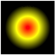
CSS
width: 150px;
height: 150px;
background: radial-gradient(red 0, yellow 30%, black 60%, black 100%);
通过在两个颜色间中间点定义过渡位置
CSS
background: linear-gradient(45deg, red, 50%, blue);渐变重复
下例定义从 0 到 25 为蓝色,25px 到 50px 的红色,并进行重复后产生渐变的进度条。

CSS
background: repeating-linear-gradient(90deg, blue, 25px, yellow 25px, 25px, red 50px);径向重复
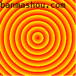
CSS
width: 200px;
height: 200px;
background: repeating-radial-gradient(100px 100px, red 0%, yellow 15%);